Frederic goudy
Born in Springfield, IL. august 3, 1865
1887 moved to minnesota
1888-bookkeeper for credit and mortgage companies, taught himself typography and printing
worked in his father's real estate office in Hyde County, South Dakota
1889 works in real estate in Chicago, also in rare book department of A.C. McClurg
1892 put out magazine called modern advertising but only has a few issues produced
1895 opened Camelot Press in Chicago with lauren c. hooper(English instructor), prints “American Chap-Book” but went bankrupt within a year
He produced his first typeface design in 1896, a display face called Camelot for Camelot press. Sold for $10 to the Dickinson Type Foundry
Began teaching that inspired William A. Dwiggins, Oswald Cooper, and R. Hunter Middleton
In 1897 Goudy married a bookkeeper named Bertha M. Sprinks
1900 became a lettering instructor at Holme's School of Illustration
In 1903, he and Will H. Ransom founded the Village Press in Park Ridge, Illinois(but later moved to Boston and then NY)
1908 village press burned to ground, destroyed everything
1908 produced typeface for Lanston Monotype Machine Company: E-38, sometimes known as Goudy Light
1911- first really successful typeface: Kennerly Old Style, for an H.G. Wells anthology published by Mitchell Kennerly
1915: Goudy Oldstyle (his most widely used type) was released by the American Type Founders Company (It has graceful letters and allows for more type on a page)
Designed mostly display fonts during the beginning of his career, as time went on and he developed he was more interested in perfecting the roman typefaces
Goudy taught at the Art Students League (1916–24) and New York University (1927–29).
In 1920, became the Art Director at Lanston Type Co.
Drew his typefaces by hand, strongly disliked mechanical techniques so
1925- set up type foundry in his home in Marlborough, New York
1939-home and foundry burned down
Dedicated the rest of his life to teaching –caligraphy at university of Syracuse (1940)
From 1920–1947, Goudy was art director for Lanston Monotype
designed 122 typefaces and published 59 literary works
"Anyone who would letterspace blackletter would steal sheep."
At 40 considered himself a failure, but made 113 fonts during the next 36 yrs
124 typefaces in total
Died in Marlborough-on-Hudson on nov 5, 1947
http://www.typographia.org/1999/graphion/goudy.html
http://en.wikipedia.org/wiki/Frederic_Goudy
http://www.linotype.com/396/fredericwgoudy.html?PHPSESSID=a79de2b5103459841f694037f181f0d0
http://www.pointlessart.com/education/loyalist/typeTalk/goudy2/goudy.html
http://www.britannica.com/
http://web.archive.org/web/20001210030800/webcom.net/~nfhome/goudy.htm
Wednesday, October 15, 2008

Tuesday, September 23, 2008
modernism and constructivism
Modernism: late 19th - early 20th century, shaped by industrialization and urbanization of western society. Functionality and progress were key concerns. Modernist typefaces forced viewers to see everyday differently using unfamiliar forms. In artwork such as paintings, deliberate distortion was used as well as large flat areas of color. ‘form follows function’ which means that the form of letters and words grows out of their purpose, their materials and how they are used. Out of early modernist typography came the sans-serif typeface.
Constructivism: originated in Moscow in 1920, lasted until 1934. It dismissed “pure” art for art that had social purposes. Constructivism believed in the use of industrial materials to create non representational objects, often geometric. Constructivism was influential to modernism with its black and red sans serif fonts that were arranged in asymmetrical blocks.
 Johnston typeface (modernism)
 constructivism
 constructivism
http://www.cs.ucsb.edu/~almeroth/classes/tech-soc/2006-Fall/nov-07.ppt
http://www.type.co.uk/images/imgs/products/gillsans_weights.gif
http://www.nationmaster.com/encyclopedia/Graphic-artist
http://www.nationmaster.com/encyclopedia/Johnston-%28typeface%29
http://www.nationmaster.com/encyclopedia/Constructivism-%28art%29#Constructivist_Graphic_Design
http://blushandflax.blogspot.com/2008_01_01_archive.html
http://www.eprarebooks.com/cgi-bin/phillips/89
Constructivism: originated in Moscow in 1920, lasted until 1934. It dismissed “pure” art for art that had social purposes. Constructivism believed in the use of industrial materials to create non representational objects, often geometric. Constructivism was influential to modernism with its black and red sans serif fonts that were arranged in asymmetrical blocks.
Question: What typeface came from modernism?

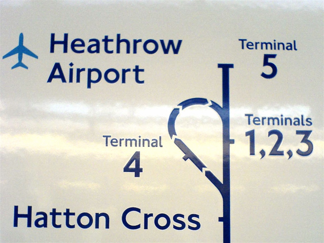 Johnston typeface (modernism)
 constructivism
 constructivism
http://www.cs.ucsb.edu/~almeroth/classes/tech-soc/2006-Fall/nov-07.ppt
http://www.type.co.uk/images/imgs/products/gillsans_weights.gif
http://www.nationmaster.com/encyclopedia/Graphic-artist
http://www.nationmaster.com/encyclopedia/Johnston-%28typeface%29
http://www.nationmaster.com/encyclopedia/Constructivism-%28art%29#Constructivist_Graphic_Design
http://blushandflax.blogspot.com/2008_01_01_archive.html
http://www.eprarebooks.com/cgi-bin/phillips/89
Tuesday, September 16, 2008
definitions
Absolute Measurement-measurements of fixed values. measurements expressed in fixed terms that cannot be altered, ie: points and picas.
Relative Measurement-measurements that have no perscribed, absolute size, ie: character spacing.
Points-the unit of measurement used to measure the type size of a font. Refers to the height of the type block, not the letter itself. Equivalent to 1/72 of an inch.
Picas-unit of measurement equal to 12 points that is commonly used for measure lines of tpe. There are 6 picas (72 points) in an inch.
x-height-the height of the lowercase 'x'. It varies from typeface to typeface. Also used as key reference point in layout of designs.
The em-a relative unit of measurement used in typesetting to define basic spacng functions, and therefore it is linked to the size of the type. If typesize increases, so does the size of the em.
The en-unit of relative measurement queal to half of one em. An en rule is used to denote nested clauses, but it can also be used to mean 'to' in phrases such as 10-11.
Dashes (hyphen, en, em)-en and em used in punctuation to provide a measurement for dashes. Not the same as a hyphen, but related. An en is half of an em, a hyphen is one third of an em. Hyphens used to link words, for compound words etc. En dash used to separate page numbers, dates and to replace the word to in constructions implying movement. Em dash used to form lines and house nested clauses.
Alignments:
Justifcation-uses three values for type setting: minimum, maximum and optimum values. Words spacing is irregular in justified type.
Flush Left-The alignment of text or graphics up against the left side of the page
Flush Right-The alignment of text or graphics up against the right side of the page
Letterspacing-the addition of space between letters to improve visual look of type.
Kerning-the removal of space between letters to improve the visual look of type, manually or automatically.
Tracking-the amount of spacing between the characters
Word Spacing-the amount of space between words
Widow-a single word as last line of a paragraph
Orphan -A line of type beginning a new paragraph at the bottom of a column or page
Leading-refers to the space between lines of text in a text block.
Indent-text lines that are moved in from the margin by a specified amount.
First Line Indent- the text indented from the left margin in the fist line of the second and subsequent paragraphs.
Hanging Indent-the indentation from the left or right margin that affects several text lines, but first line is not indented.
Relative Measurement-measurements that have no perscribed, absolute size, ie: character spacing.
Points-the unit of measurement used to measure the type size of a font. Refers to the height of the type block, not the letter itself. Equivalent to 1/72 of an inch.
Picas-unit of measurement equal to 12 points that is commonly used for measure lines of tpe. There are 6 picas (72 points) in an inch.
x-height-the height of the lowercase 'x'. It varies from typeface to typeface. Also used as key reference point in layout of designs.
The em-a relative unit of measurement used in typesetting to define basic spacng functions, and therefore it is linked to the size of the type. If typesize increases, so does the size of the em.
The en-unit of relative measurement queal to half of one em. An en rule is used to denote nested clauses, but it can also be used to mean 'to' in phrases such as 10-11.
Dashes (hyphen, en, em)-en and em used in punctuation to provide a measurement for dashes. Not the same as a hyphen, but related. An en is half of an em, a hyphen is one third of an em. Hyphens used to link words, for compound words etc. En dash used to separate page numbers, dates and to replace the word to in constructions implying movement. Em dash used to form lines and house nested clauses.
Alignments:
Justifcation-uses three values for type setting: minimum, maximum and optimum values. Words spacing is irregular in justified type.
Flush Left-The alignment of text or graphics up against the left side of the page
Flush Right-The alignment of text or graphics up against the right side of the page
Letterspacing-the addition of space between letters to improve visual look of type.
Kerning-the removal of space between letters to improve the visual look of type, manually or automatically.
Tracking-the amount of spacing between the characters
Word Spacing-the amount of space between words
Widow-a single word as last line of a paragraph
Orphan -A line of type beginning a new paragraph at the bottom of a column or page
Leading-refers to the space between lines of text in a text block.
Indent-text lines that are moved in from the margin by a specified amount.
First Line Indent- the text indented from the left margin in the fist line of the second and subsequent paragraphs.
Hanging Indent-the indentation from the left or right margin that affects several text lines, but first line is not indented.
Tuesday, September 9, 2008
Adrian Frutiger
Adrian Frutiger was born in 1928 in Switzerland where his love for sculpture influenced his career in printing. He was discouraged form pursuing sculpture and instead got interested in printing, but his first love is evident in his typefaces. When he was sixteen he was an apprentice as a compositor for four years. He released his first commercial font in 1954, called ‘President.’ In 1956 he designed his first of three slab-serif typefaces, which included Univers. In 1970, his Univers font variation caused French airport authority to commissioned Frutiger. The eventual font he created used Univers but used fonts by Eric Gill, Edward Johnson, and Roger Excoffon as inspirations for the modifications. The font was called Roissy, but was renamed Frutiger when it was released for public use in 1976. In the late 1990’s Univers was re-released with sixty three  variants. He also re-released Frutiger and Avenir as Frutiger Next and Avenir Next, with additional line weights. In 2003 he was commissioned to design a new watch face for a vary rare limited-edition of watches by Ventura, a Swiss watchmaker. He also was commissioned to make a woodmark for the National Institute of Design in Ahmedabad, India, which changed its name from National Design Institute to match his NID logo on the sign.
Univers has a wide variation of styles and line weights that range from very thin to very thick and they can all be used with one another in harmony. The Univers grid shows all 21 of the weights and widths of the original type that Frutiger designed.
http://www.wikipedia.com/
http://www.myfonts.com/fonts/linotype/univers/
 variants. He also re-released Frutiger and Avenir as Frutiger Next and Avenir Next, with additional line weights. In 2003 he was commissioned to design a new watch face for a vary rare limited-edition of watches by Ventura, a Swiss watchmaker. He also was commissioned to make a woodmark for the National Institute of Design in Ahmedabad, India, which changed its name from National Design Institute to match his NID logo on the sign.
Univers has a wide variation of styles and line weights that range from very thin to very thick and they can all be used with one another in harmony. The Univers grid shows all 21 of the weights and widths of the original type that Frutiger designed.
http://www.wikipedia.com/
http://www.myfonts.com/fonts/linotype/univers/
John Baskerville
John Baskerville was born in 1706. He was a writer and a headstone engraver in England in the 18th century, but later became a printer. He set up a printing business in 1750, but it took him 7 years to produce his first book, in 1757 because he was such a perfectionist. He also had businesses in japanning and paper mache in addition, but prior to his printing and typography, but was most well known for the latter. In 1758 he became the printer for Cambridge University. He was an atheist, but in 1763 he printed his masterpiece, a folio Bible, for the University. His designs had level serifs and he contrasted the weight of heavy and light lines. He was a member of the Royal Society of Arts. Benjamin Franklin admired Baskerville, who was also a member of the Royal Society of Arts. Franklin took Baskerville’s typography designs back to the United States where they began to use them in government documents. John Baskerville died in 1775, but his wife ran the press until 1777. Because of jealous competitors, Baskerville’s fonts began to decline in popularity and became scarcely used until the 1920’s. His fonts, now mostly called ‘Baskerville’ have been re-released and given life again.
His type uses heavy and light contrasting line weights, curves, sharp serifs, and elegant forms to be unique.
http://www.wikipedia.com
http://www.myfonts.com/person/baskerville/john/
His type uses heavy and light contrasting line weights, curves, sharp serifs, and elegant forms to be unique.
http://www.wikipedia.com
http://www.myfonts.com/person/baskerville/john/
Sunday, August 31, 2008
Grids
why do we (designers) use a grid? what are the benefits or functions?
--We use it to take control of the page, for organization and to unify the page. It keeps the page from being all over the place so the message(s) are clear, and the content isn't overwhelming. Grids help to align text and photos where they are most functional for whatever the purpose of the particular item.
http://www.markboulton.co.uk/articles/detail/why_use_a_grid/
http://www.writingfordesigners.com/?paged=2
--We use it to take control of the page, for organization and to unify the page. It keeps the page from being all over the place so the message(s) are clear, and the content isn't overwhelming. Grids help to align text and photos where they are most functional for whatever the purpose of the particular item.
http://www.markboulton.co.uk/articles/detail/why_use_a_grid/
http://www.writingfordesigners.com/?paged=2
Tuesday, August 26, 2008
Paul Rand
Paul Rand was a graphic designer from New York who lived throughout most of the 20th century. He changed his name from Peretz Rosenbaum to Paul Rand to shorten and hide the obvious Jewish identity that it conveyed. His love for creating art and making logos contradicted the Orthodox Jewish belief that doesn’t allow the idolization of created images. Nevertheless, he never hesitated, beginning with signs for his father’s grocery store when he was young. He is most well-known for the logos he designed for big companies such as IBM, ABC and UPS in the 50’s and 60’s, but his reputation was established two decades prior to those creations. In 1937, at 23 years old, he took over as art director for the Esquire-Coronet magazines’ after just a year. His reputation grew over time and he began to develop the “Paul Ran look,” in which he began to integrate themes usually found in the “high arts” into his graphic designs. A lot of his more famous and successful designs were simple, but he says, “ideas do not need to be esoteric to be original or exciting” (2).
Later in his career he was turned on to reading art critics, or “art philosophers” and became inspired by Roger Fry, Alfred North Whitehead, and John Dewey. Paul Rand taught design classes at Yale University from 1956-1969. He also started teaching there again in 1974. He was inducted into the New York Art Directors Club Hall of Fame in 1972. He died of cancer in 1996. Paul Rand created the “American graphic style” (3).


(1) http://www.wikipedia.com/
(2) http://www.paul-rand.com/
(3) http://design.rit.edu/
Later in his career he was turned on to reading art critics, or “art philosophers” and became inspired by Roger Fry, Alfred North Whitehead, and John Dewey. Paul Rand taught design classes at Yale University from 1956-1969. He also started teaching there again in 1974. He was inducted into the New York Art Directors Club Hall of Fame in 1972. He died of cancer in 1996. Paul Rand created the “American graphic style” (3).


(1) http://www.wikipedia.com/
(2) http://www.paul-rand.com/
(3) http://design.rit.edu/
Subscribe to:
Posts (Atom)